October 2022 Color of the Month
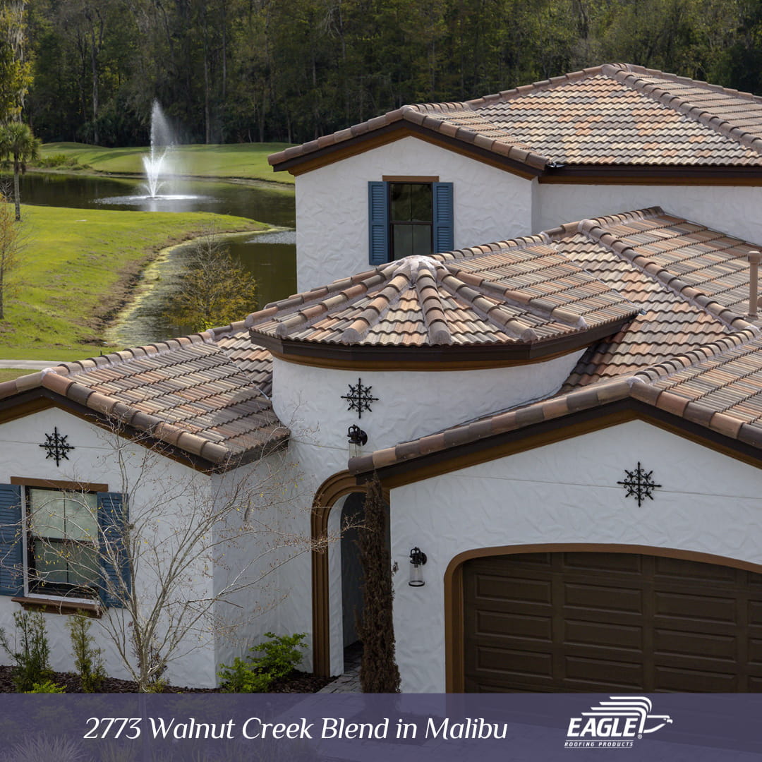
Walnut Creek Blend
Fall is here, and with it comes a new edition of our Color of the Month series. To mark the occasion, the natural winner is Walnut Creek Blend. The stunning combination of tan, orange, and dark brown is ideal to open the harvest season. You will fall in love with this concrete roof tile, which adds just the right amount of color to any exterior and provides curb appeal that will last all year-round.
Design Trends and Versatility
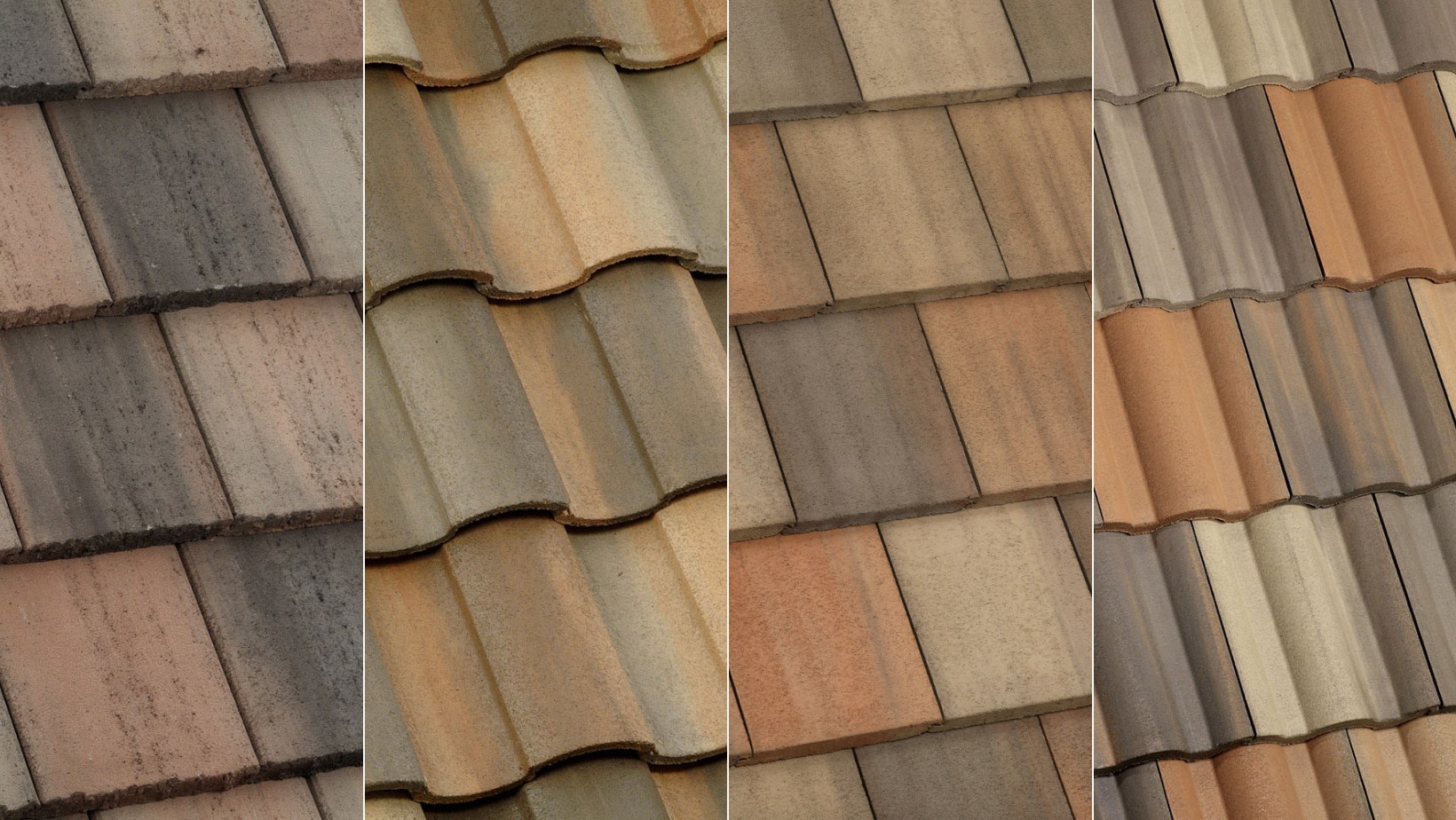
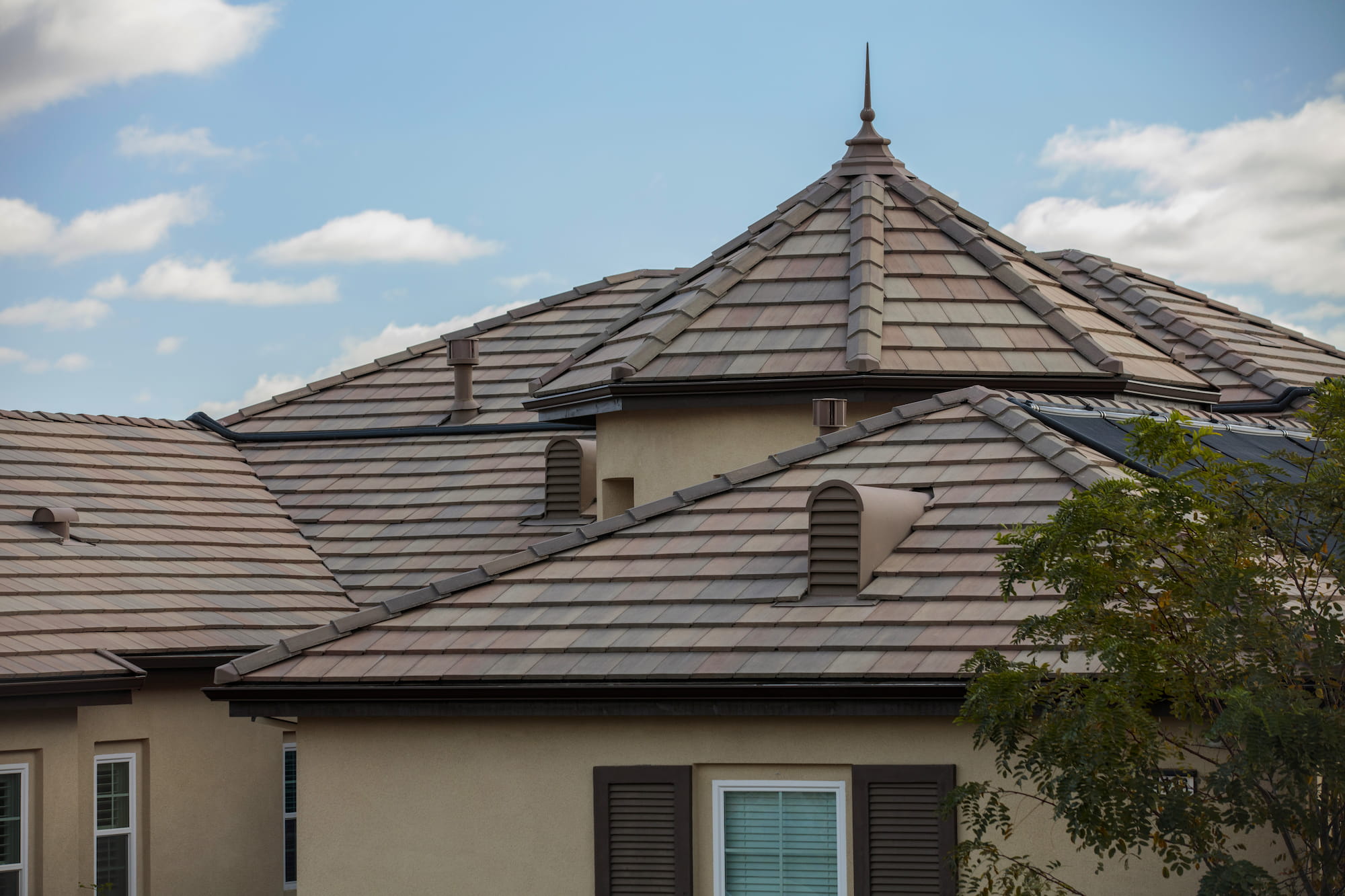
Walnut Creek Blend is wildly popular as it is available in our profiles Capistrano, Malibu, Bel Air, and Estate, making it the perfect pairing for countless architectural styles, palettes, and exterior finishes. Featured in our flat profile, Bel Air, the orange and tan hues on this tile provides a warm glow to any neutral exterior. Museum worthy, this colorful expression resembles the shades of a serene autumn afternoon. This combination allows for an endless selection of exterior paint, ranging from the most classic nudes to your most favorite rich, decadent hues.
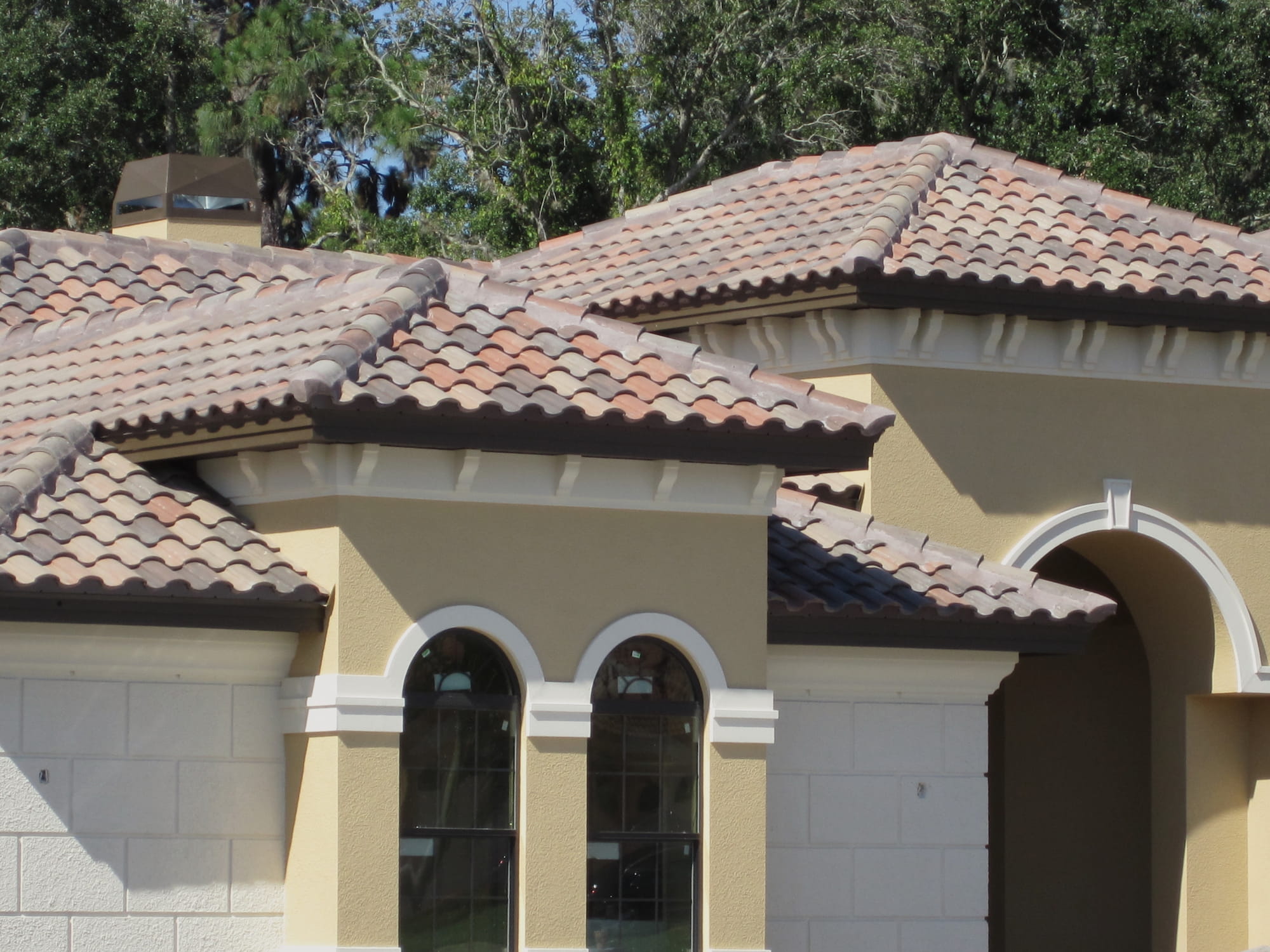
For a more refined look, Walnut Creek Blend in our Capistrano profile is an allusion to Spanish, Mediterranean and Tuscan esthetics. Simply gorgeous, this high barrel roofscape will accentuate the architectural details of your home or commercial space while complementing lighter shades, such as beige and white for a timeless look or dark browns and greens for a bold statement.
Color Exploration
As previously stated, Walnut Creek is versatile and elegant. With a concrete tile as adaptable as this one, it is always important to investigate exterior design trends and elements that are already present on the structure before choosing a color palette, as those details can change the final product.
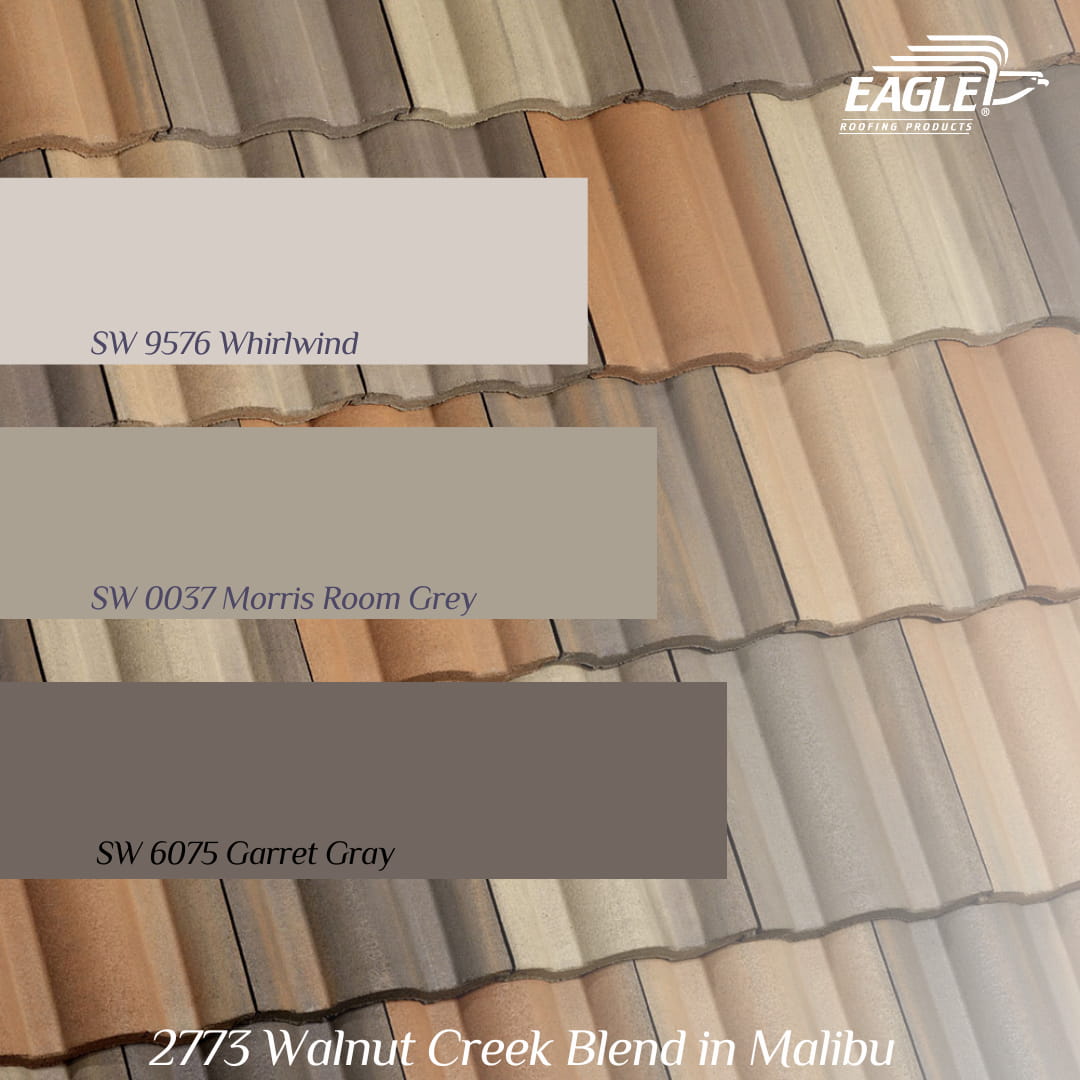
A color scheme that would allow this glorious concrete roof tile to shine on its own, consists of neutral shades that have been trending for the past years; and their popularity continues to rise. Sherwin-Williams 9576 Whirlwind is a soft grey with blue undertones that allows for a perfect complementary combination against the orange present on Walnut Creek Blend. Following the classic theme, Sherwin-Williams 0037 Morris Room Grey provides the right amount of deepness needed to emphasize and complement the brown hues on this tile, and for a final step Sherwin-Williams 6075 Garret Gray adds richness to smaller details on the structure such as window frames and architectural decorations or use it as a bold statement for the front door.
A nonconventional yet attractive approach for an exterior color scheme is a beautiful contrasting color palette. Consider a course of action such as glossing the body of your home using Sherwin-Williams 7035 Aesthetic White. With your home coated in this stunning off-white hue, you are now able to use other daring colors such as those featured in this scheme as accents to enhance décor, metal, and siding. For instance, Sherwin-Williams 6349 Pennywise evokes that warm, inviting feeling that boosts curb appeal and blends seamlessly with the burnt orange hues on Walnut Creek Blend. To create contrast, Sherwin-Williams 7742 Agate Green has the ideal balance between green and gray, reminiscent of the fallen leaves of the Autumn season. Use these two shades wisely for added brightness on shutters, window and door frames or in smaller details such as pots and vases that complement your landscaping.
To request a free sample of Walnut Creek Blend, contact your local Eagle Account Representative or visit the nearest Design Center
More Style Inspiration
